How to Make a Christmas Postcard in Google Slides?
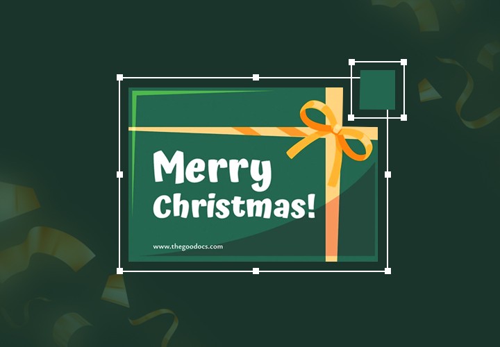
While Christmas is approaching, we still have time to put in some effort and love to buy presents, write down menus, make lists to do, and of course, design a jolly postcard!
Although many of us may think that sending a Christmas card can be a boring idea, yet, believe us, that’s an underrated present! Millions of people adore receiving postcards, as they reflect good old traditions and serve as a Christmas symbol. Moreover, sending personalized postcards can be a delightful way to spread joy and connect with loved ones.
Whether you want to design a postcard from start to finish or utilize pre-designed templates (later, we’ll offer you a collection of free templates), first, follow us, get inspiration, and think of design ideas!
Now take a cup of hot chocolate, and get ready to unleash the festive spirit to life with Google Slides! 🎁
Creating a Merry Christmas Postcard from Scratch
To create your postcard from scratch, start by opening a new Google Slides project. You can find Google Slides in your Google Drive or by visiting slides.google.com. Once you're in, click on Blank to start with a clean document.
Step 1. Setting up Correct Dimensions
We have opened a blank document and named it as a Christmas Postcard.
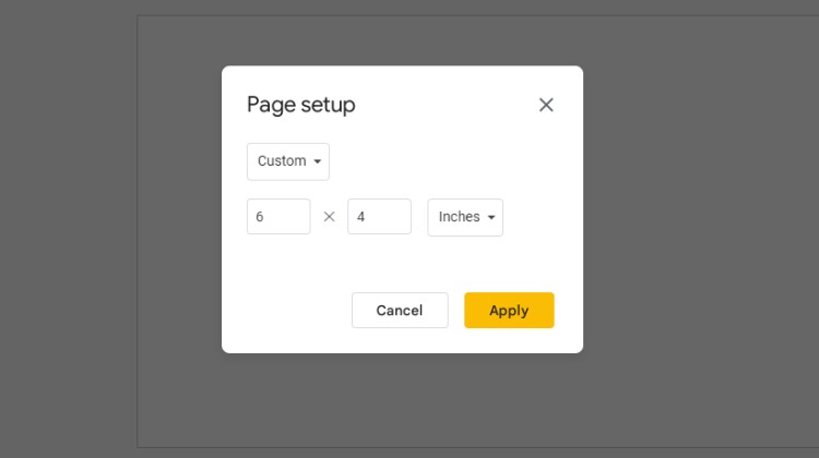
Next up, it's time to set the dimensions and background of your postcard. Go to the File tab, select Page Setup, choose Custom, and then type in the appropriate dimensions for your postcard. Standard postcard sizes are typically 6x4 inches, but feel free to choose the size that suits your preferences.
Click Apply.
2. General Layout and Color Palette
Let’s think about the colors we want to use and the overall layout.
In case you don’t know where to start and lack inspiration, you may go to Pinterest and browse some ideas, as well as color palettes. Save pins you like and create a mood board.
Here is the one that we will use today!
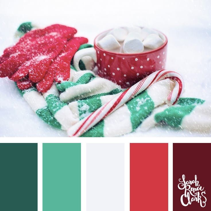
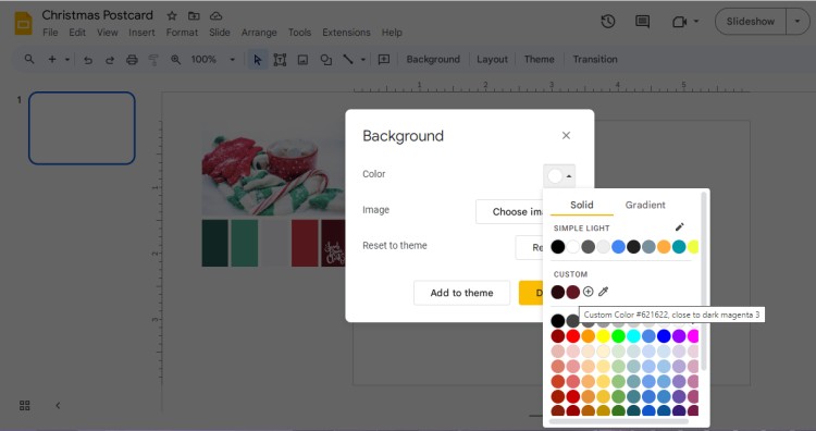
Now let’s change the background color to Red #621622. Choose the Background tab from the toolbar options, and choose Solid. Now use a color picker to choose the color from our palette or click “+” to find the color manually.
Step 3. Add a Text
First, we will add a text (for instance, Merry Christmas or Happy Holidays) and a short quote. Thus, we will know that the rest of the place can be used for illustration.
To divide the space equally, go to View – Guides – Add Vertical Guide.
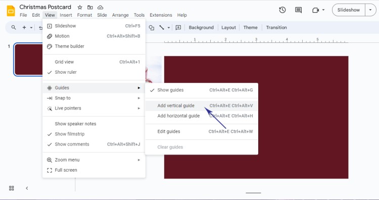
Choose the Text box from the toolbar and place it left.
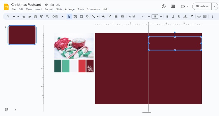
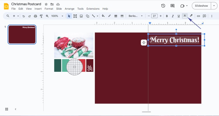
Now type in Merry Christmas!
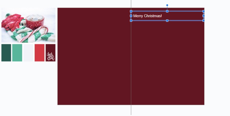
As the text is plain and small, let’s customize it – choose a more attractive font from the toolbar menu and adjust the text size.
In case you don’t see suitable fonts, click More Fonts and choose those you like from the list.
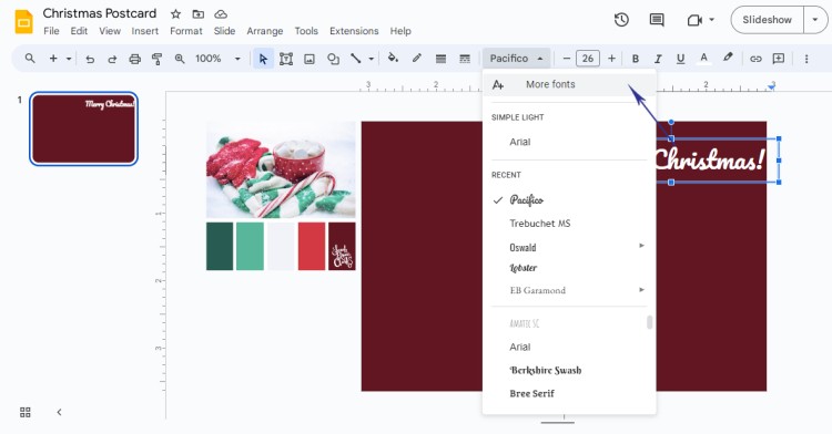
We used Berkshire Swash font with size 27. Now to change the color you need to highlight the text, find the Text color on the toolbar menu, and use a color picker to choose the light grey #f2f3f8 from our mood board.
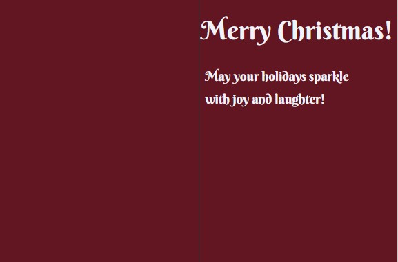
To add the wish, copy-paste our text box and change the content to “May your holidays sparkle with joy and laughter”! Later, if necessary, we can add more text and customize it.
Step 4. Inserting Images or Adding Illustrations
Here comes the most fun and creative part! You can either add an existing image from your PC or browse free stock photos (that’s an easy way), or try out creating simple vector illustrations in Google Slides!
As you already guessed, we can try building a Christmas tree out of available shapes and color them. As an alternative, we can use different shapes to form an abstract Christmas tree. That depends on your idea.
Let’s draw an oval shape by heading to the toolbar menu and selecting oval from the Shape tab. Fill it with Dark Green color #285b52.
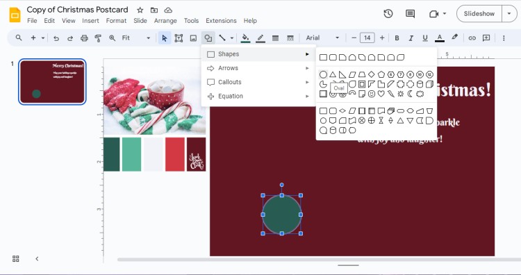
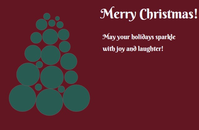
We are going to use oval shapes to build an abstract tree. Copy and paste the same shape multiple times (with the same color) and place accordingly.
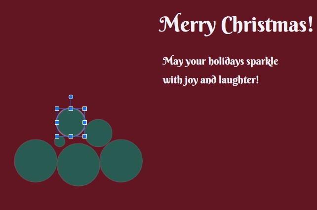
Continue in the same pattern – resize shapes where you need to suit the tree shape.
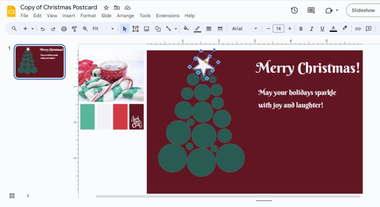
It’s time to add more elements. Go to the Shape tab, Callouts, and choose a star shape. Draw it at the top of our tree. Use a light grey color to fill it.
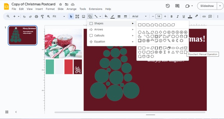
Choose a Flowchart from the Shapes again. It will serve as a vase. Fill it with a light grey color.
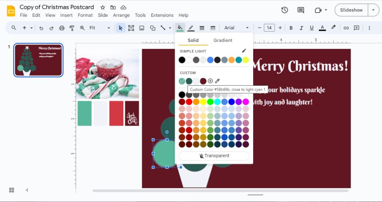
Let’s add more light to our tree by changing the color of the oval shape to lighter green #58b69b.
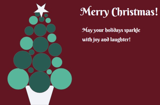
Choose the whole illustration by dragging a selection rectangle (an arrow on the toolbar menu) and right-click to view the submenu and choose Group.
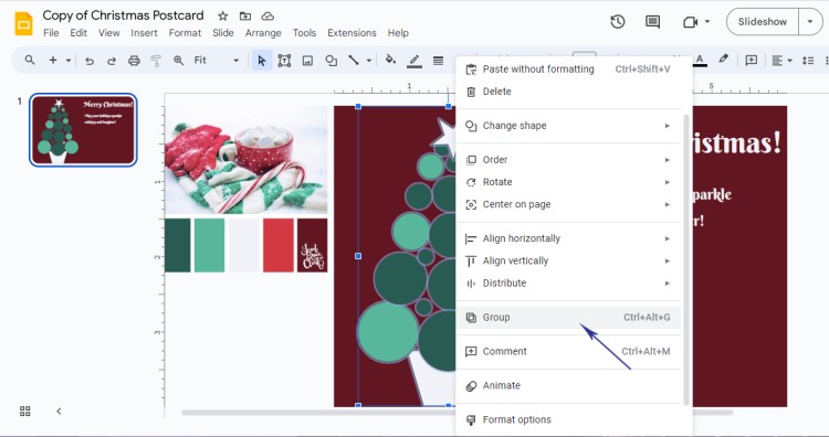
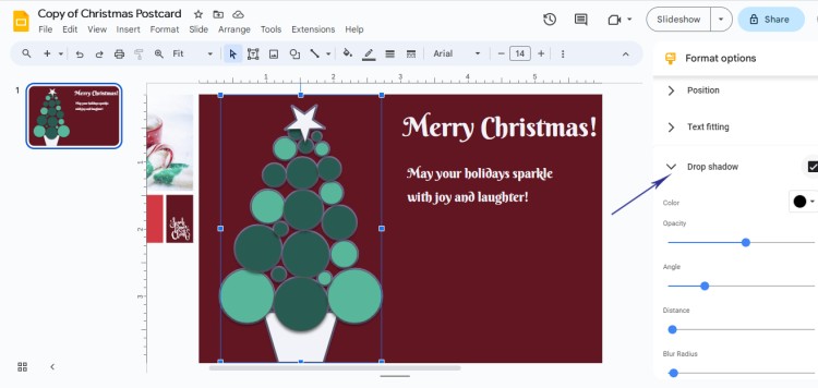
As the overall illustration looks too flat, we can add shadow to all of the elements by choosing Format options. From there, activate the Drop shadow effect and slightly increase the opacity.
Next what we can do is to draw gifts near the tree vase. Choose either a Rectangle or a Round Corner Rectangle to draw the shape of the gift. Fill it with light red berry color #d33943.
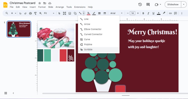
Now go to the Line tab and select a Scribble to draw a ribbon. You may use yellow color to make it pop out.
After you have drawn the ribbons, group the gift illustration and add a shadow as we did previously.
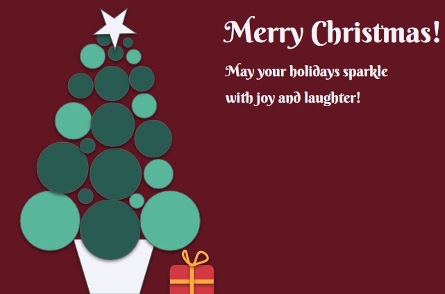
Now copy the gift and slightly change colors and resize the shape to make it look different.
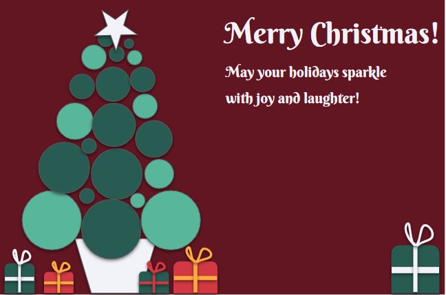
Step 5. Designing the Backside of the Postcard
Duplicate the slide and remove the tree illustration and Merry Christmas text block.
Now we will place gifts on the left side of the postcard in the chaotic order. Use a scribble line to draw some random ropes.
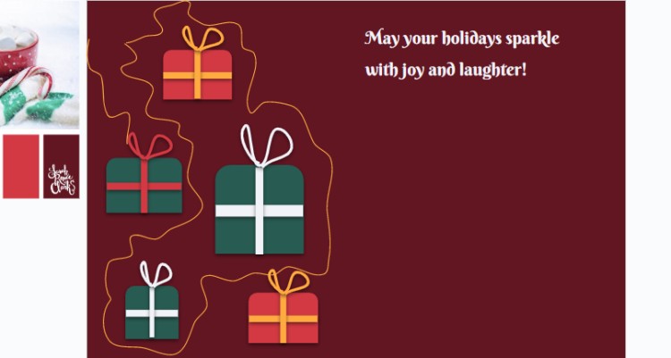
Change the wish in the text box and use the same formatting - light grey color and Berkshire Swash font.
Additionally, place several lines below the wish box to suit the postcard theme. Add a new text box to write down “With Love”.
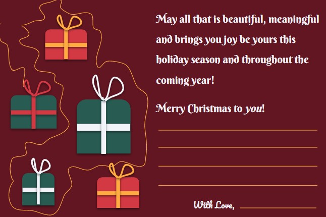
Step 6. Adding Finishing Touches and Finalizing Your Postcard
Before you wrap up your Christmas postcard, add some finishing touches to make it truly special. Consider adding decorative elements like borders, dividers, or even some subtle glitter.
Let’s get back to the first slide and place the text box more to the center, so it fills the empty gap. Add additional elements like stars from Shapes.
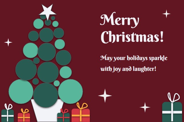
Now when we are satisfied with our postcard, we may save it or print it out. Let’s see how it looks.
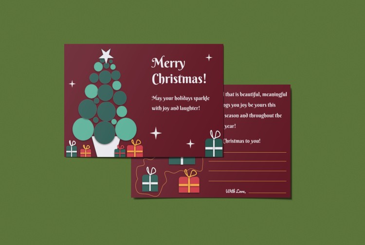
Exploring Pre-designed Templates. Customizing a Postcard Template.
If you're short on time or looking for some design inspiration, fear not - Google Slides has got you covered with a range of pre-designed templates. Head over to the Template Gallery in Google Slides and browse through the available postcard templates. Or you may visit TheGoodocs.com to find amazing postcard templates and additional Christmas templates for other planning purposes. From classic and elegant designs to playful and whimsical ones, you'll find something to suit your taste and style.
Now we will customize a postcard from our website and demonstrate how it is beneficial for anyone who lacks time.
After we have opened the postcard template, let’s check what changes can be made: change and recolor existing text, add wishes or quotes, and add extra elements. But the purpose of the pre-designed template is to simply change addresses and our messages, the rest is perfectly fine!

On the first slide, we removed text and added a simple short wish. Now let’s move on to the second slide and type in “With Love”. Add a line for the name.

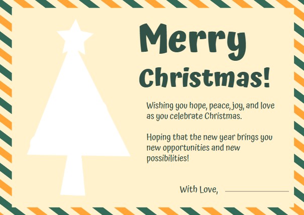
That’s all! You can make simple changes while drinking your hot cocoa and watching a Christmas movie.
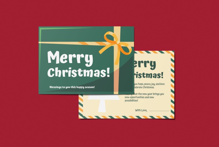
Tips and Tricks for Designing an Impressive Christmas Postcard
While you have learned many skills while following our tutorial, we would like to share with you useful tips that might help you to overcome the messy design or avoid a fear of the blank page.
🔸Keeping the design simple and clutter-free
When it comes to designing your Christmas postcard, simplicity is your key. Avoid cluttering your postcard with too many elements or overwhelming visuals. A clean and organized design allows the recipient to focus on the message and the festive spirit.
🔸Using contrasting colors for impact
To make your postcard visually striking, use contrasting colors. Colors like red and green, gold and silver, or even white and blue can create a vibrant and eye-catching design. Don't be afraid to play with color combinations to make your postcard pop.
🔸Incorporating holiday-themed elements in your postcard
To infuse the holiday spirit into your postcard, incorporate festive elements. Consider including snowflakes, holly, mistletoe, or even images of gifts and stockings. These small touches remind the recipient of the joyous season and add a festive flair to your design.
🔸Creating a visually balanced composition
Balance is essential in any design, including your Christmas postcard. Pay attention to the placement and size of elements to create a visually pleasing composition. Aim for symmetry or asymmetry, depending on your desired aesthetic, to ensure that nothing feels out of place.
🔸Utilizing white space effectively
Don't underestimate the power of white space! It provides breathing room for your design and helps highlight the important elements. Embrace the whitespace to create a sense of elegance and sophistication in your Christmas postcard.
Now when you are armed with our tips and tricks, you're ready to create an impressive Christmas postcard in Google Slides. Feel free to use templates or make a stunning postcard from scratch!
So, grab a mug of hot cocoa, turn on your favorite holiday tunes, and let your creativity flow.
Happy designing and Merry Christmas!

We are a team of creative people who dream of sharing knowledge and making your work and study easier. Our team of professional designers prepares unique free templates. We create handy template descriptions for you to help you choose the most suitable one. On our blog, you'll find step-by-step tutorials on how to use Google Products. And our YouTube channel will show you all the ins and outs of Google products with examples.


