How to Change Indentation Spacing and Line Spacing in Google Slides
Google Slides is a powerful tool for creating visually appealing presentations. While most users are familiar with basic features like adding images and text, mastering advanced formatting techniques can greatly enhance your presentation.
Two key elements that significantly impact the overall aesthetics and readability of your slides are indentation and line spacing. Today, we will delve into the intricacies of adjusting indentation and line spacing, providing you with useful tips and addressing frequently asked questions. By the end of this tutorial, you will have the necessary knowledge and skills to create amazing and eye-catching presentations with impeccable formatting. 💫
Significance of Indentation in Slide’s Formatting
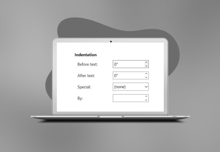
Indentation may seem like an inconsequential detail, but it plays a crucial role in organizing and structuring your slide content. It refers to the space or distance between the slide's edge and the text within a text box or shape.
By adjusting the indentation, you can create a sense of hierarchy and visually differentiate between different levels of information. It's like giving your content a well-deserved VIP treatment!
Indentation greatly aids reader engagement by providing visual cues that help the reader navigate through the text. When paragraphs are properly indented, it becomes easier for a reader to quickly identify where each paragraph begins, allowing them to easily follow the flow of ideas. This enhances the overall readability of the text and prevents confusion, ensuring that readers can focus on the content rather than struggling to locate the beginning and end of paragraphs.
Furthermore, indentation plays a crucial role in distinguishing between paragraphs. By indenting the first line of each paragraph, readers can immediately recognize when a new topic or idea is being introduced. This clear demarcation enables readers to easily differentiate between different sections and helps them mentally organize the information they are reading.
Adjusting Indentation in Google Slides
Now that we understand the importance of indentation, let's put that knowledge into action. We will use an educational presentation from our platform as a sample.

Method 1. Format Menu Option.
To adjust the indentation of your text, follow these simple steps:
1. Let’s open our presentation and choose the slide to format. Select the text box or shape containing the text you want to indent.

2. Click on the Format menu at the top. Choose Align & indent from the dropdown menu.
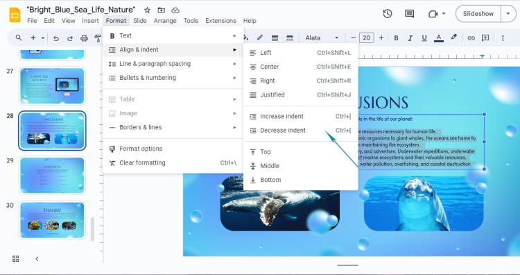
3. In the sidebar that appears, you'll find options to adjust the left and right indentation.
Increase indent: This option will position the text more to the right.
Decrease indent: This option makes the text start more to the left.
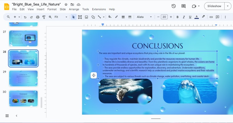
Let’s choose Increase Indent to move our next aside from the main sentence. Here is the result.
Method 2. Modifying Indents by Dragging the Markers
You can easily modify indentation by dragging markers on the ruler. Let’s see how to do that.
1. First, make sure you have the Ruler option visible. If not, go to View > Show ruler.
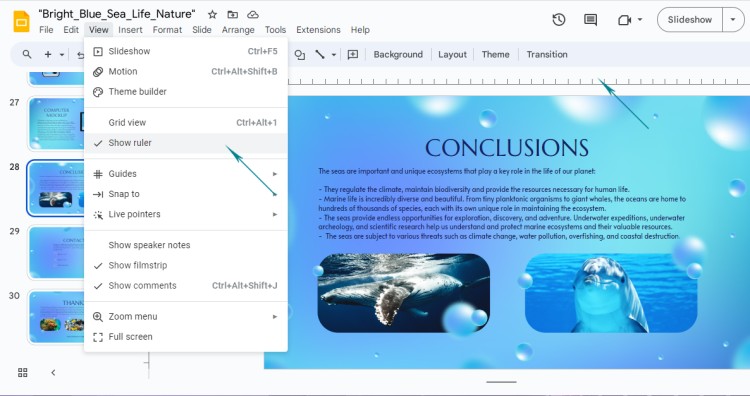
Now let’s select the text to modify.

2. Now when the text is selected, you will see two markers on the ruler - one for the left indent and one for the right.
In our case, we will drag the left marker to the right.
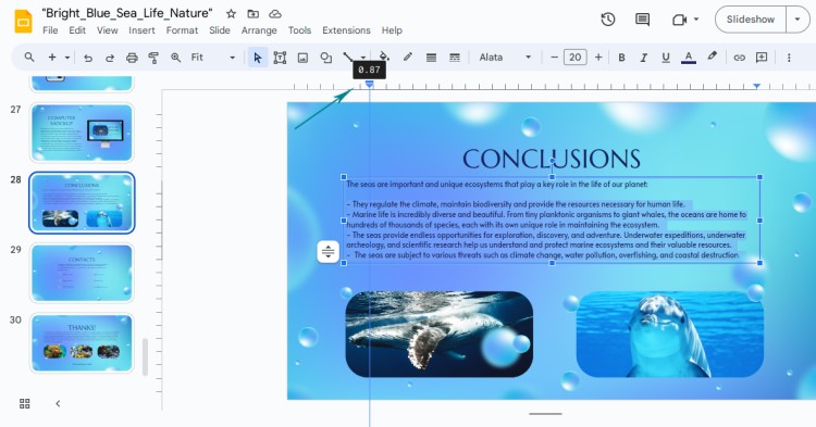
3. See the result.
That’s very easy and can increase the presentation’s overall perception!

But that’s not all – we do have to format our text to make it visually appealing by highlighting the first sentence and thus, making it stand out.
Another way to bring your text to life is to change the Bullet list – go to Format – Bullets and numbering. You’ll see a Bulleted list menu that allows you to choose different types of bullets.

💡 Remember, moderation is essential! Too much indentation can make your slides look cluttered, while too little can make them feel unorganized. Experiment with different levels of indentation and formatting until you find the sweet spot that enhances the visual appeal of your presentation.
Changing Line Spacing and Its Impact on Text Readability
Line spacing, my friends, is all about giving your text some breathing room. It refers to the vertical space between lines of text within a paragraph or text box. Adequate line spacing helps prevent your slides from looking cramped and makes them a joy to read. After all, no one wants to strain their eyes trying to decipher a wall of text!
By adjusting line spacing, you can control the distance between lines, making them more legible and visually pleasing. Whether you prefer a tight and compact look or a more generous and airy feel, line spacing lets you strike the perfect balance.
To modify the line spacing, follow these simple steps:
1. Select the text box or the specific text you want to adjust the line spacing for.
We will choose the same paragraph to make it more readable.
2. Click on the Format tab at the top of the screen. In the dropdown menu, go to Line Spacing and click on it.
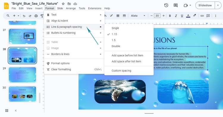
3. A submenu will appear with various options for line spacing. Choose the one that suits your needs.
There are four types of line spacing options: Single, 1.15, 1.5, and Double.
Let’s apply 1.5 spacing and whether it is suitable.

4. You can also select Custom spacing if you want to manually set the spacing between lines. In the dialog box that appears, enter your desired spacing value. Apply.
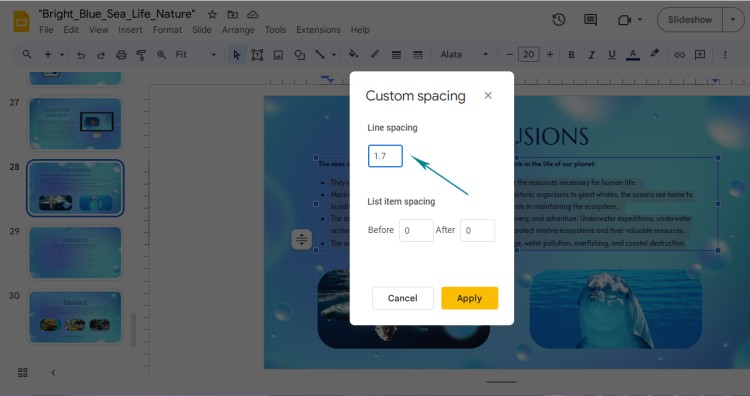
5. Preview the changes, whether you are satisfied with the result or need to add more spacing.

💡 Remember, you can always experiment with different line spacing settings to find the perfect balance for your presentation.
Useful Tips to Make Your Text Stand Out
Formatting your Google Slides is not just about changing the indentation and line spacing – it's about creating a visually appealing and organized presentation. Here are some handy tips to help you achieve that:
1. Consistency is key: Maintain consistent line spacing throughout your slides to avoid distracting changes in spacing.
2. Use indentation wisely: Indentation can be an effective way to emphasize key points or separate different levels of information. However, excessive indentation can make your slides look cluttered.
3. Consider the font size: Adjust the font size in relation to the line spacing. If you have larger line spacing, using a slightly larger font size can enhance readability.
4. Don't forget about alignment: Properly align your text and other elements on your slides to ensure a clean and professional look.
5. Test your presentation: Always preview your slides in presentation mode to make sure the formatting looks great on the big screen.
By following these tips, you'll be able to create visually appealing slides that captivate your audience.
Frequently Asked Questions (FAQ)
Now we would like to address some common queries and provide solutions related to indentation and line spacing in Google Slides.
Q: Can I adjust line spacing for specific lines instead of the entire text box?
A: Yes, you can. Simply highlight the specific lines within the text box and apply the desired line spacing.
Q: Is there a maximum line spacing limit in Google Slides?
A: There isn't a fixed maximum limit, but keep in mind that very large line spacing values may result in overlap or excessive white space.
Q: Can I change the indentation for bulleted or numbered lists?
A: Absolutely! Select the list and use the Increase indent or Decrease indent buttons on the toolbar to adjust the indentation level.
Q: Will changing the line spacing affect the font size?
A: No, adjusting the line spacing won't automatically change the font size. However, it's good practice to ensure the font size complements the line spacing.
💡Remember, practice and experimentation will help you become more familiar with formatting options in Google Slides.
Recap of Our Tutorial and Final Thoughts
Congratulations! You've learned how to change indentation and line spacing in Google Slides. By mastering these formatting techniques, you can take your slide design to the next level.
Here's a quick recap:
💎 To adjust line spacing, select the text box or specific text, go to the Format tab, choose Line spacing, and select the desired option or set a custom value.
💎 Use indentation wisely to emphasize key points without overwhelming your audience.
💎 Maintain consistency in line spacing, font size, and alignment for a polished look.
💎 Take advantage of presentation mode to ensure your formatting looks great during your actual presentation.
Remember, proper indentation and line spacing can greatly enhance the readability and aesthetic appeal of your slides. So, don't underestimate their importance when creating your next presentation.
Now go forth, format away, and create slides that amaze! Good luck! ✨

We are a team of creative people who dream of sharing knowledge and making your work and study easier. Our team of professional designers prepares unique free templates. We create handy template descriptions for you to help you choose the most suitable one. On our blog, you'll find step-by-step tutorials on how to use Google Products. And our YouTube channel will show you all the ins and outs of Google products with examples.


