How to Make Charts in Google Slides

One key feature of Google Slides is the ability to create charts and graphs, which can help to illustrate data and make presentations more engaging. Now we will go over creating charts process in Google Slides step-by-step, including tips and tricks for making the most effective charts possible. Let’s keep going!
Creating a Chart
Step 1: Open Google Slides and Select a Slide
The first basic step is to open your Google Disk by signing in to your Google account.
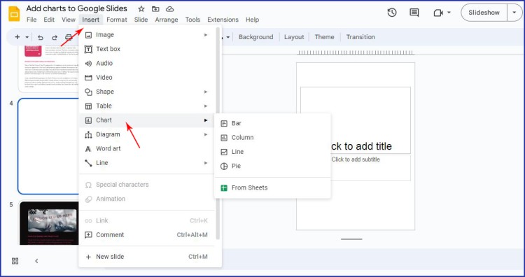
To create a chart, you will need to open a new or existing presentation. For this tutorial let’s assume you already have a premade presentation, where you need to add a chart. Once you have opened a presentation, navigate to the slide where you want to add your chart. From there, click Insert in the top menu bar and select Chart from the dropdown menu.
Step 2: Choose a Chart Type
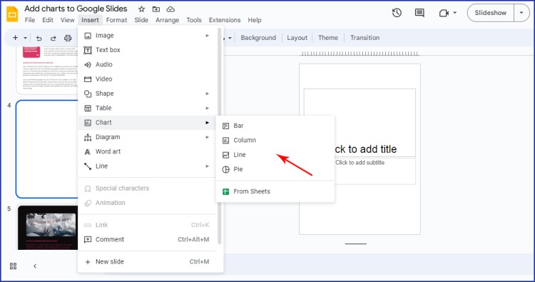
After selecting Chart, a new window will open that will allow you to choose a chart type. You will find several options, including bar, line, pie, and more. Think carefully about the type of data you want to represent and choose the chart type that will work best.
Step 3: Add Your Data
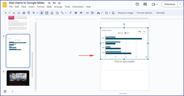
Once you have selected your chart type, you will be prompted to add your data. For this tutorial let us choose a bar type to show as an example.
Editor will automatically provide you with a sample chart, but you can replace the sample data with your own information. You can either enter your data manually or copy and paste it from a spreadsheet.
Step 4: Choosing your data
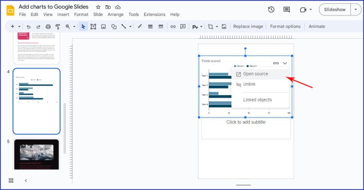
To show the necessary data according to your presentation, you need to click Open Source on the top right corner of the bar chart.
P.S. You can customize the data range later if you need to make any changes.
Step 5: Working with a spreadsheet data
Once you are redirected to the Google spreadsheet, you need to enter your figures to create “your data” bar. You will see columns that contain data and a bar chart below. Just click on the columns data and you can easily insert your figures and change the names of columns.
As soon as you changed the date, your chart in spreadsheets will change accordingly.
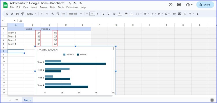
Working with the Chart Design
Step 6: Customization
Once you have specified the data range, you can customize the chart to fit your preferences. Double-click on the chart. The Chart editor will be opened on the right side. You can change the chart's colors, fonts, and labels.
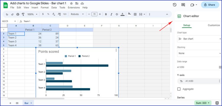
Setup menu: you can get control over the chart type design, stacking, and data range. If you click on the Chart type option, you can see several variables of how your chart may look like. Choose the one that is most suitable for your case study.
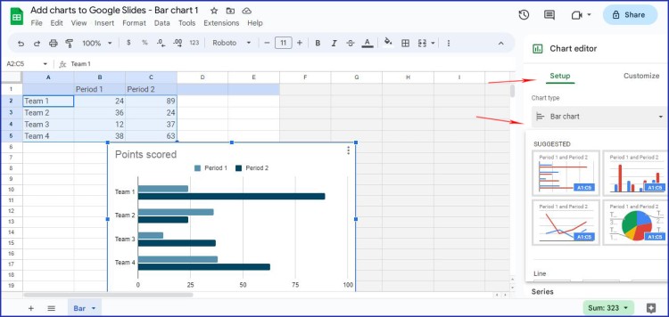
Customize menu: you can easily modify Chart style, Legend, and Gridlines.
Chart style allows changing a chart theme background color, chart border color, and font style.
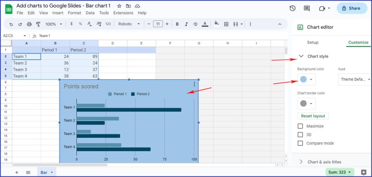
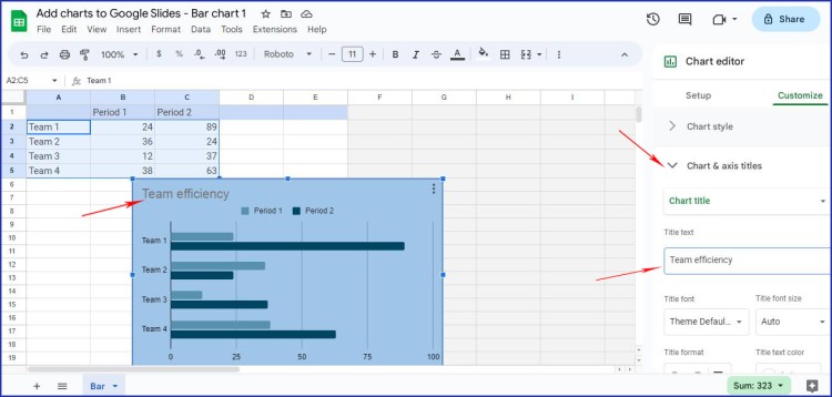
You can also add a title to the chart by clicking on Chart & Axis Titles.
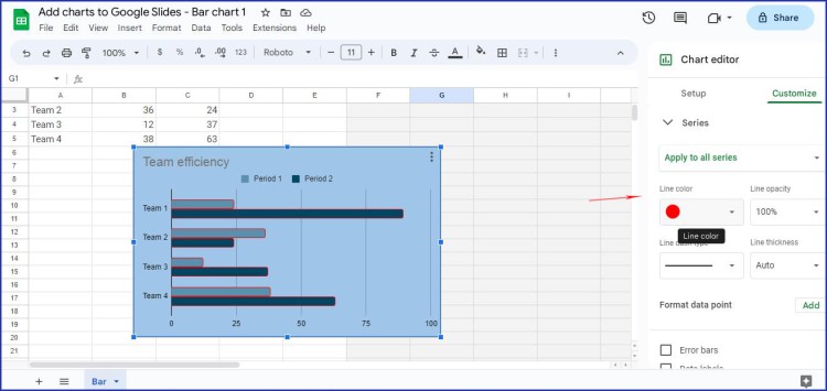
In the Series submenu, you can choose a chart line color and line opacity. Try to find the most suitable line thickness and color to highlight the work efficiency or data significance. It will look more appealing and helps to gather the audience’s attention.
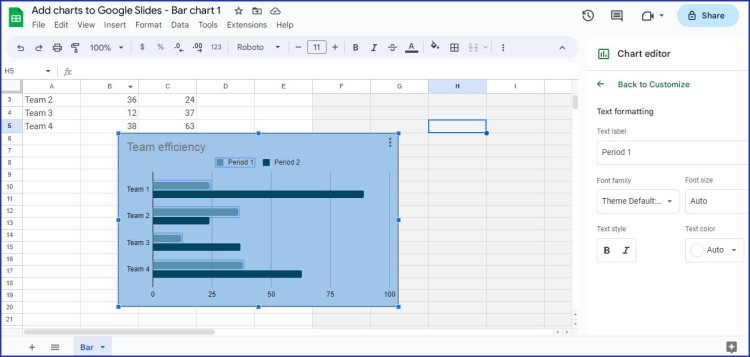
Step 7: Adding text
It's also possible to add text boxes or images to your chart to provide additional context. Simply click on the Text box or Image icon on the top navigation bar and add your desired content.
Step 8: Removing columns
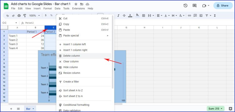
When we choose a chart type, all charts go by default and offer several columns. But what if you need to visualize only one column? Or perhaps you need to insert even more?
To delete a bar or add one, go to your data points in a spreadsheet. Click on the top of the necessary column. The whole section will be highlighted. Choose Delete column from the dropdown menu. The chart in Google Sheet will be automatically updated.
Final Steps
Step 9: Updating chart in Google Slides
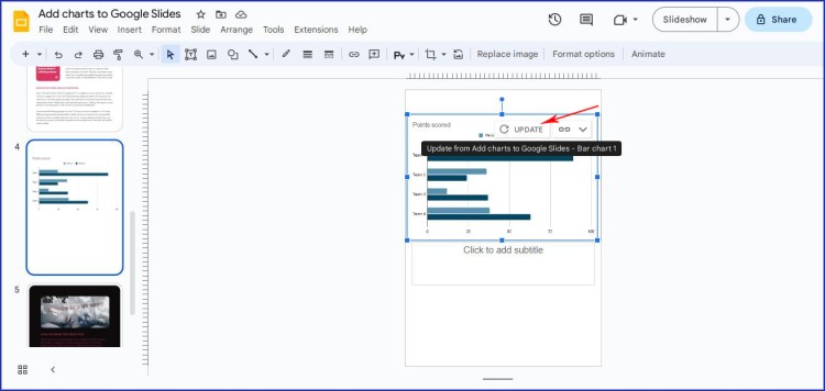
Once you have finished customizing your chart in spreadsheets, let’s not forget that a chart in your presentation is still the same. Go to the top right corner of your chart and click Update. Google Slides will automatically update your chart.
Step 10: Link your chart to spreadsheets
There is an option to copy-paste your ready-to-use chart from Google Sheet to the presentation. Press Ctrl/Cmd + C. Now you have to link it with a spreadsheet in case you want to make further changes.
One great feature of Google Slides is the ability to link your chart to a Google Sheet. This means that any changes made to the data in the Google Sheet will automatically update your chart. To link your chart, click on the Data tab and select Link to Spreadsheet. You will then be prompted to choose the Google Sheet where your data is stored.
As in this tutorial, we were modifying the automatically generated Google Sheet our chart is already linked to it. In case, we unlink it any further changes in our data sheet won’t be updated within the chart.
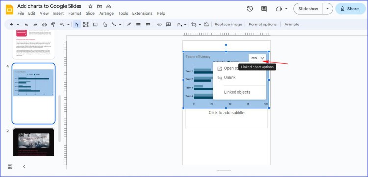
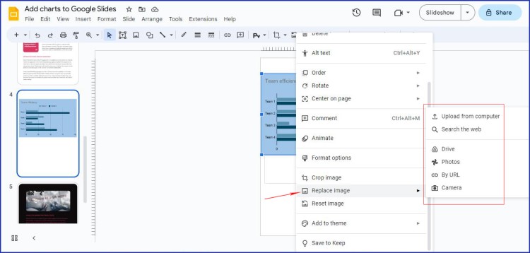
In case you have a prepared chart with other data and you don’t have time to make changes in Google spreadsheets, you may click on the chart’s top right corner to choose Replace image. Now choose the image source.
Additional Ways to Add a Chart
There are two more ways to add a chart to the Google Slides without getting too much into details.
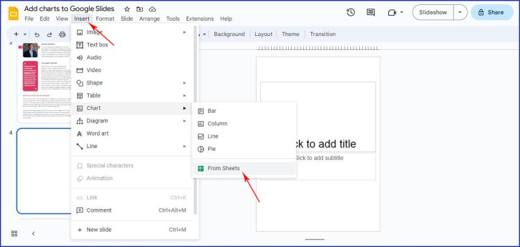
⦁ In case you have prepared data in Google Sheets and it is relevant to your presentation, choose a slide, where you want to add a chart, click Insert and choose Chart – From Sheets. Find the necessary Google Sheets document and the chart will be built according to its data.
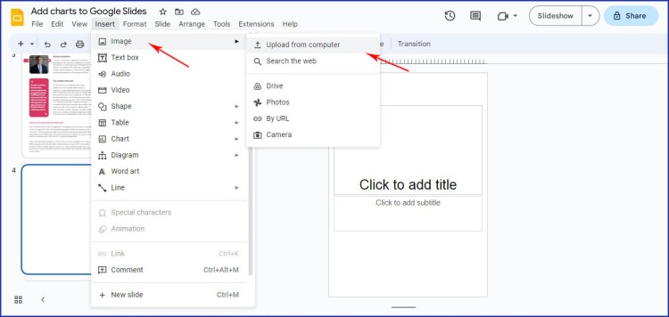
⦁ If you don’t want to mess around building a chart in Google Slides and lining it with your data in spreadsheets, here is a simple decision. If you have any chart as an image in jpg. or png. formats that suit your task, simply click Insert – Image and choose the way to your image (where it is saved on your PC).
Final glance: Now when we are at the finish line, check once again if your data is visually correct and follow the below Tips and Tricks to create more appealing charts.
Tips and Tricks for Making Effective Charts
⦁ Now that you know how to create charts in Google Slides, let's go over some tips and tricks for making them as effective as possible.
⦁ First, keep your charts simple and easy to read. Avoid cluttering your chart with too much information, and make sure that the labels are easy to understand.
⦁ Second, choose colors and styles that are visually appealing and match the theme of your presentation. Avoid using too many colors or styles, as this can be distracting.
⦁ Finally, use your charts to tell a story. Don't just present numbers and data - use your charts to illustrate a point or convey a message.
If you’re still thinking about whether to create charts or not we recommend giving it a try. Your presentation will be more appealing and date-based.
In conclusion, creating charts in Google Slides is a simple process that can enhance the visual aspect of your presentation. With just a few clicks, you can select the type of chart you want, specify your data range, and customize it to fit your preferences. And, by linking your chart to a Google Sheet, you can ensure that it remains up to date with any changes made to your data.
Have you liked our tutorial? Or maybe you are already on the way to your Google Slides presentations to insert your first chart? By following the steps outlined in this article and using the tips and tricks provided, you can create effective charts that will engage your audience and help to illustrate your data.
So what are you waiting for? Start creating charts in Google Slides today!

We are a team of creative people who dream of sharing knowledge and making your work and study easier. Our team of professional designers prepares unique free templates. We create handy template descriptions for you to help you choose the most suitable one. On our blog, you'll find step-by-step tutorials on how to use Google Products. And our YouTube channel will show you all the ins and outs of Google products with examples.


