How to Make a Bar Graph on Google Sheets?
A bar graph is an effective way to visually represent data and compare different categories or groups. In this tutorial, we will guide you through the process of creating a bar graph in Google Sheets. Whether you're a student, professional, or data enthusiast, learning new amazing skills can help you present your data in a clear and organized manner.
Creating a Bar Graph: Getting Started
Before we dive into the process, let's take a quick overview of Google Sheets and how to access it. It is a free web-based application offered by Google as part of the Google Drive suite. It allows users to create, edit, and collaborate on spreadsheets online.
To access an application, simply open your web browser and go to sheets.google.com. If you have a Google account, sign in with your credentials. In case you are not registered, you can create an email and enter the account for free. Once you're signed in, you'll see a list of your existing spreadsheets or you can create a new one.
Now let's jump straight to the process.
Follow the steps below:
1. Adding data to the spreadsheet
Start by entering your data into the cells of the spreadsheet. Use separate columns for each category or group you want to compare in the bar graph.
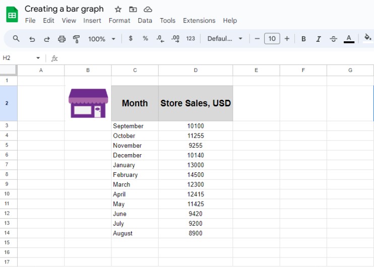
For this tutorial, we’ll create a simple fictional data table with values like Store Sales per month and analyze which month was more profitable last year.
2. Selecting the data for the bar graph
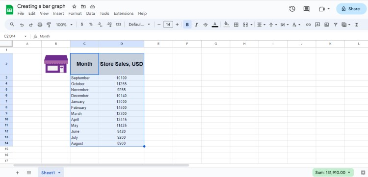
Once you have entered your data, click and drag to select the range of cells you want to include in the bar graph. Be sure to include the labels for each category or group.
In our case, we have two columns, one with months and one with sales revenue.
3. Inserting the bar graph
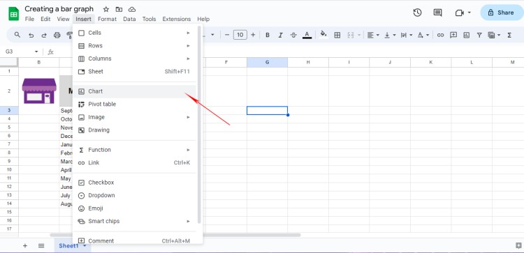
With the data selected, 👉 click on the Insert tab in the top menu and select Chart.
You will see a chart appear right near the table with values in the default version of the line chart. Additionally, a sidebar will open on the right side of the screen.
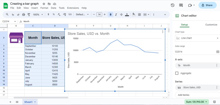
4. Customizing the bar graph
👉 Double-click on the bar graph in case you don’t see a chart editor.
In the sidebar, you can customize various aspects of the bar graph, such as the type of bar graph (e.g., vertical or horizontal), the style of bars, the axes, labels, colors, and more.
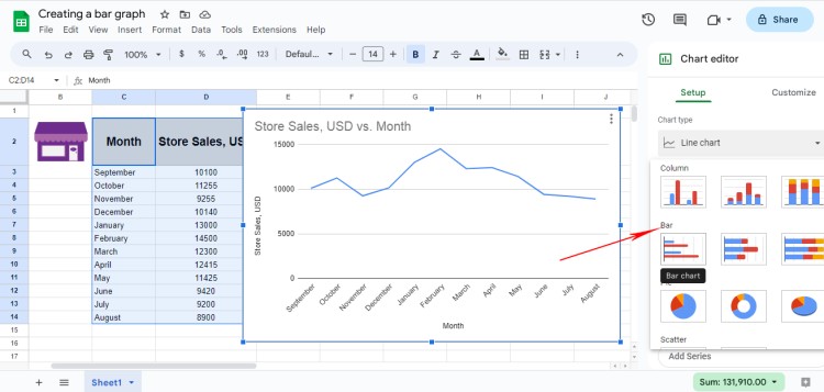
For now, our task is to change the type of chart to Bar type. 👉 Click on Chart Type, and scroll down till you see the Bar. Select the first one or any other you think is suitable.
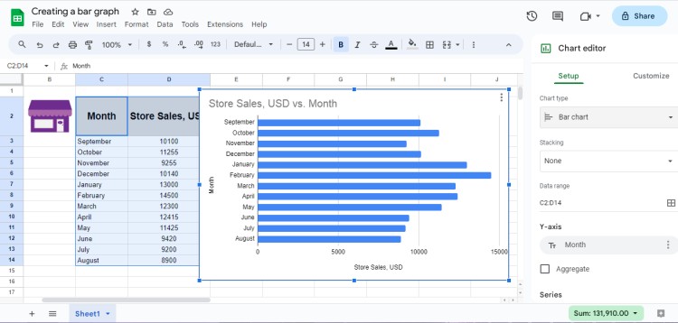
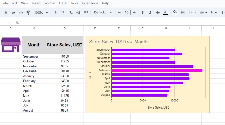
Here is the result. Now the chart looks more applicable and we see that the most profitable month is February.
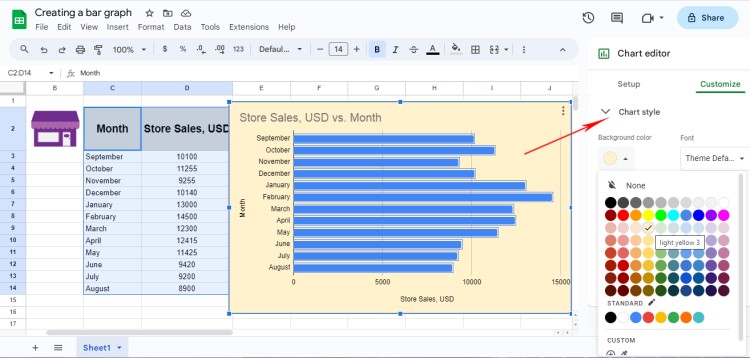
Now if you don’t like the default white background, you can experiment with other colors. Go to Chart style, Background color. You will see the color palette opens right away.
Let’s choose light yellow.
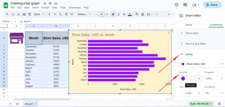
Next, let’s change the color of all bar lines. First of all, 👉 click on the bar element, next go to Series, Fill Color. Choose the one suitable for your theme.
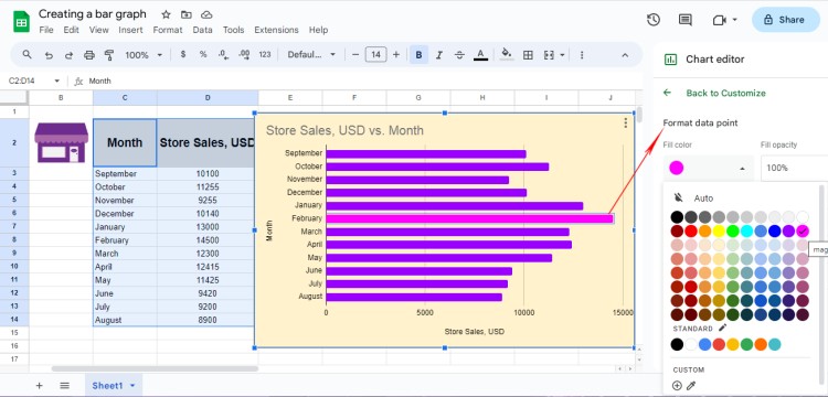
Now let’s highlight the most profitable month and 👉 click on the separate bar line for February to make it workable. Go to Format Data Point – Fill Color. We’ll use magenta.
You are free to explore the different options available and make adjustments as necessary. It all depends on your task and what you would like to demonstrate to your audience.
Our final result! Congratulations, now you know how to create a simple bar graph J
Tips for Creating a Professional-looking Bar Graph
To create a professional-looking bar graph that effectively communicates your data, consider the following tips:
· Choosing the right type of bar graph: Depending on the nature of your data, you may choose between a vertical bar graph (commonly used for comparing different categories) and a horizontal bar graph (useful for comparing values within a single category).
· Formatting the axes and labels: Ensure that the axes are labeled clearly and accurately. You can edit the axis titles by selecting them and typing new text. Additionally, you can adjust the scale and orientation of the axes to best fit your data.
· Adding a title and legend: A descriptive title will help your audience understand the purpose of your bar graph. You can also include a legend to provide an explanation of the different colors or patterns used in the graph.
· Adjusting the colors and styles: Use colors and styles that are visually appealing and enhance the readability of your bar graph. Google Sheets provides various customization options, allowing you to modify the colors, patterns, borders, and transparency of the bars.
FAQ (Frequently Asked Questions)
We know you may have many questions and it takes time to get used to working in spreadsheets. Thus, here is some Q&A for you guys!
Q1: Can I add multiple bar graphs to a single sheet?
Yes, you can add multiple bar graphs to a single sheet. Simply select the data for each bar graph separately and follow the steps mentioned earlier to insert the graphs into the sheet.
Q2: How do I edit the data in a bar graph?
To edit the data in a bar graph, you need to revise the values in the spreadsheet table. Make any necessary changes to the data, and the bar graph will automatically update to reflect the new values.
Q3: Can I create a bar graph from imported data?
Yes, you can create a bar graph from imported data in Google Sheets. Simply copy and paste the data into a new sheet, follow the steps to select the data, and insert a bar graph as explained earlier.
Creating a bar graph on Google Sheets is a simple and efficient way to present your data visually. We hope that by following the steps outlined in this tutorial and implementing the tips provided, you can create professional-looking bar graphs that effectively communicate your data.
Don't hesitate to explore additional tutorials about working in spreadsheets posted on our blog to further enhance your skills in data visualization!
Wish you can master all skills in one go!

We are a team of creative people who dream of sharing knowledge and making your work and study easier. Our team of professional designers prepares unique free templates. We create handy template descriptions for you to help you choose the most suitable one. On our blog, you'll find step-by-step tutorials on how to use Google Products. And our YouTube channel will show you all the ins and outs of Google products with examples.


