How to Create an Organizational Chart in Google Slides?

Organizational charts are a powerful visual tool that helps businesses and teams understand their hierarchy and structure. Below, we will show you the process of creating an organizational chart, both from scratch and by using the pre-designed hierarchy template. Additionally, we will provide you with tips for creating an effective organizational chart that can improve communication and collaboration within your organization.
Ready? Then let’s keep going!
Creating an Organizational Chart from Scratch
If you would like to practice your design skills in Google Slides and create a professional org chart, here is your chance! By following our guide, you will be able to complete this task from the blank sheet in just 30 minutes! Maybe less?)
1. Launching Our Document
Open the existing document or create a new one by going to https://slides.google.com and signing in to your Google account.
We will create a new document and name it Org Chart.
2. Creating Shapes
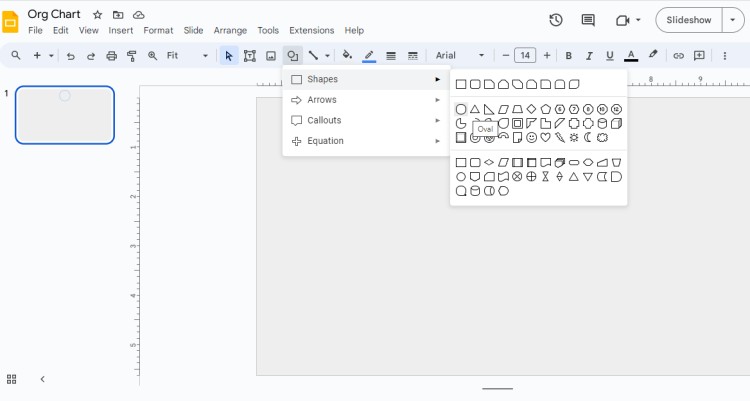
In Google Slides, click on the Insert tab in the top menu and select Shapes from the dropdown menu. Or directly choose the Shape from the toolbar. Choose the shape that represents the main position or person in your organization and insert it onto the slide.
We mentioned the shape for the “main” position – that must be a CEO or President or Department Officer. It depends on what type of chart you are going to create – whether it’s for one department or for a whole company. For now, let’s go with creating a shape for the CEO.
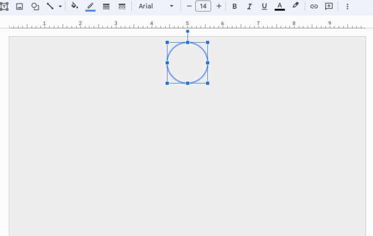
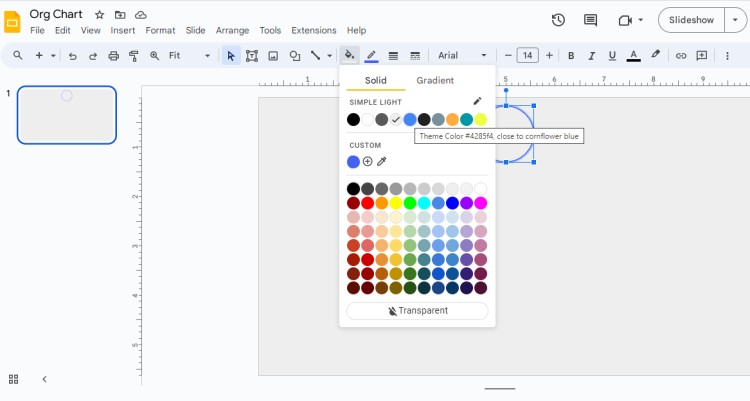
Let’s give it a color by clicking on Fill Color on the toolbar - blue HEX #4262f4.
3. Adding Next Shapes
Now when we have placed the top shape of the company structure, let’s add further departments, senior executives, managers, and assistants.
You are welcome to use the same shape or choose any other type like Rectangle or Rounded Rectangle.
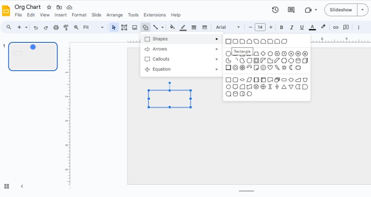
Now we’ll copy as many rectangles as we need – let’s add three heads of departments. Below add more shapes for managers or assistants.
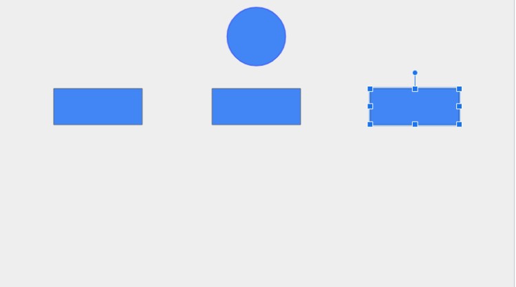
Here’s what we’ve got!

4. Adding Text
Double-click inside the shape to enter your text. Add the name or title of the position/person and any additional details such as department, contact information, or responsibilities. Format the text using the options available in the toolbar, such as font size, color, and alignment.
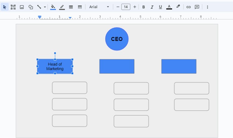
Customize fonts by using Bold type or you are welcome to change text color. We’ll leave black color.
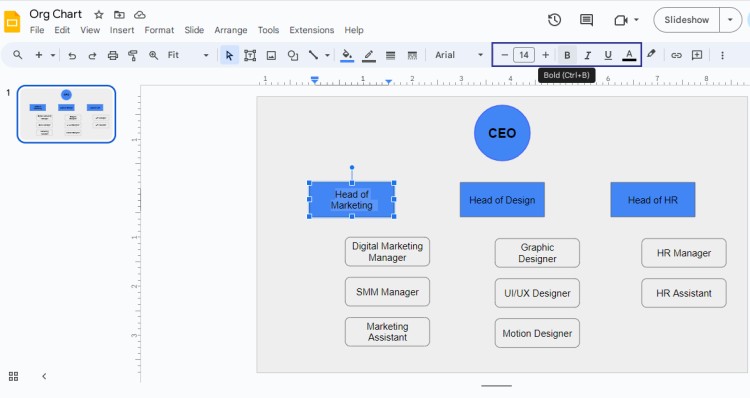
5. Connecting Shapes
To connect the shapes and create the hierarchy, click on the Line shape in the toolbar and draw lines between the positions/people. You can adjust the line's color, thickness, and style to match the design of your chart.
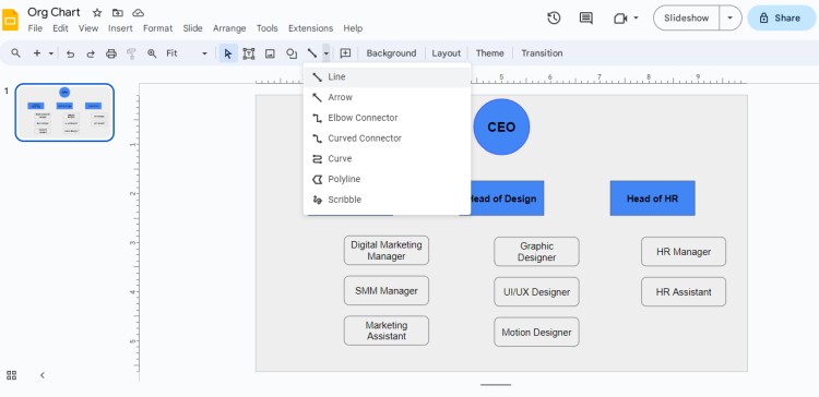
We’ll use the Elbow Line to connect the rest of the shapes.
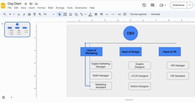
Now we have all shapes connected.
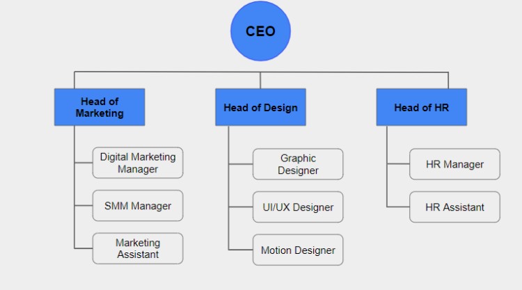
6. Customizing the Chart
Once you have finished creating the basic structure of your organizational chart, you can customize it further. Google Slides offers various customization options such as changing the colors and styles of the shapes, adding images or icons, and adjusting the layout.
For this step, we will fill with color each department to make it visually appealing.
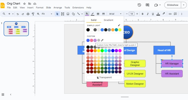
We ended up changing the font color to White. This way it looks more professional and soft.
As the final touch, add background whether with your company branding elements or any related elements by selecting Background from the toolbar.
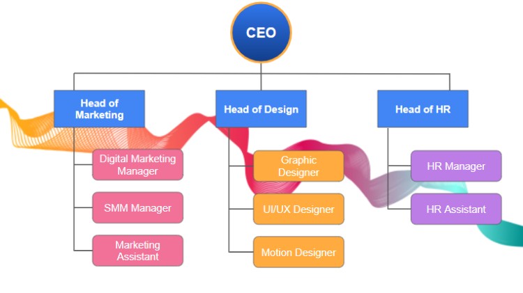
Creating an Organizational Chart from the Hierarchy Template
And here is good news for you!
If you prefer a quicker and easier approach, Google Slides provides pre-designed hierarchy templates that you can use as a starting point. Follow these steps to create an organizational chart from the hierarchy template.
1. Accessing Hierarchy Templates
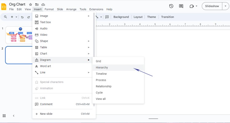
Go to Insert and choose Diagram. From there, choose Hierarchy.
2. Choosing the Template
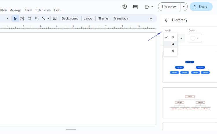
Scroll through the template categories and select how many levels you would like to see in the chart. Slides offer 3, 4, and 5 levels. You can also choose the chart color straightaway.
3. Editing the Chart
Once you have selected a template, Google Slides will apply the chart on the blank page.
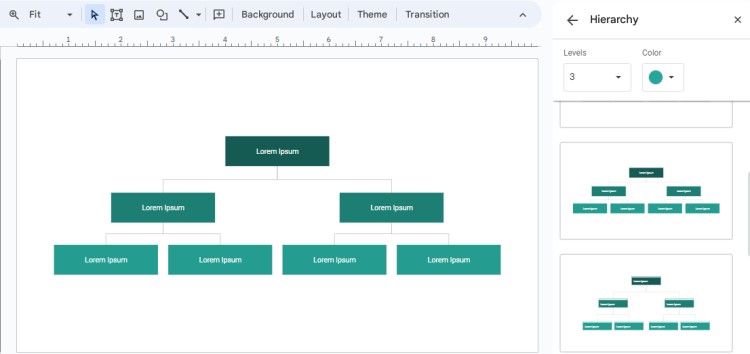
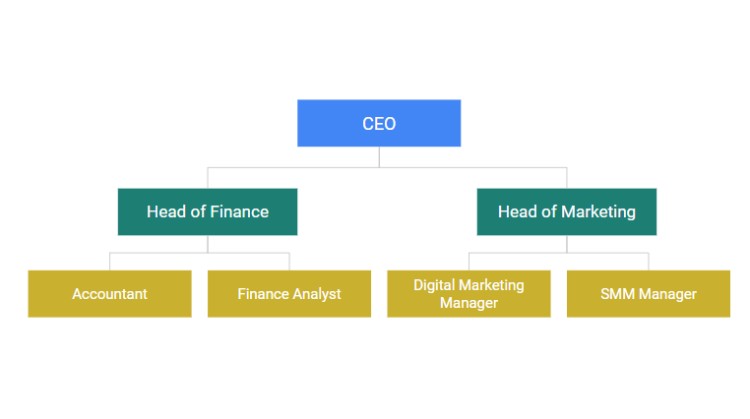
You can now edit the text, replace placeholder content with your own organization's positions and names, and customize the chart as needed. Use the Fill Color to recolor shapes and rename hierarchy as we did before.
So, which method do you like best? Creating a chart from scratch or using a hierarchy template?)
At any rate, both can be used well.
Tips for Creating an Effective Organizational Chart
An effective organizational chart enhances communication and clarity within an organization. Moreover, it can be used for presentations, brochures, or even downloaded to the website.
Thus, the design and clarity shouldn’t be neglected.
Tip 1: Simplify the Structure
Keep the structure of your organizational chart simple and easy to understand. Avoid overcrowding it with too many positions or unnecessary details. Focus on the main roles and relationships within your organization.
Tip 2: Use Consistent Formatting
Maintain consistency in the formatting of your organizational chart. Use the same font style, size, and color across all positions, and align the text consistently. This ensures a professional and cohesive look.
Tip 3: Clearly Define Roles and Responsibilities
Ensure that each position in your organizational chart has a clearly defined role and responsibilities. This helps everyone in the organization understand their own role and know who to approach for specific tasks or decisions.
Tip 4: Limit the Number of Levels
Avoid creating an organizational chart with too many hierarchical levels. Too many levels can make it confusing and difficult to read. Instead, aim for a maximum of three to five levels, depending on the size and complexity of your organization.
Frequently Asked Questions (FAQ)
Q1: Can I change the layout of the chart after creating it?
A: Yes, you can easily change the layout of your organizational chart in Google Slides. Select the entire chart, go to the "Arrange" tab in the toolbar, and choose from the available layout options. Experiment with different layouts to find the one that best fits your needs.
Q2: Can I export my organizational chart as an image or PDF?
A: Yes, you can export your organizational chart as an image or PDF in Google Slides. Go to the "File" menu, select "Download", and choose your desired format. This allows you to share the chart with others who may not have access to Google Slides.
Q3: Can I collaborate with others on the organizational chart?
A: Yes, Google Slides allows for collaboration. You can invite team members or colleagues to edit the organizational chart together in real-time. Simply share the Google Slides file with them, grant them editing access, and work on the chart simultaneously.
As you see, creating an org chart is a simple yet creative process! We believe you can do it well. Whether you choose to create a chart from scratch or use a pre-designed hierarchy template, Google Slides offers powerful tools and customization options.
And we will prepare more tutorials on working with Google applications and designing templates! Welcome to follow our page :)

We are a team of creative people who dream of sharing knowledge and making your work and study easier. Our team of professional designers prepares unique free templates. We create handy template descriptions for you to help you choose the most suitable one. On our blog, you'll find step-by-step tutorials on how to use Google Products. And our YouTube channel will show you all the ins and outs of Google products with examples.


