How to Create a Graph in Google Sheets?

One of the significant advantages of using Sheets for creating graphs is its simplicity and accessibility. The application offers a simple intuitive interface that allows even non-technical individuals to generate visually appealing graphs with just a few clicks. Moreover, being a cloud-based platform, everyone can access their documents from any device like a laptop, smartphone, or tablet, making collaboration and sharing of information hassle-free.
So, let’s dive in!
Reasons Why We May Need to Build a Graph
Data visualization is crucial in data analysis as it allows us to present complex information in a clear and concise manner. Here are some compelling reasons why graphs are necessary:
📍 Understanding Trends and Patterns
By visualizing data in graph form, it becomes easier to identify current trends and customer journey that may not be immediately apparent in raw numbers or spreadsheets (we talk about massive data). Whether it's tracking monthly sales performance or analyzing stock market fluctuations, graphs provide an intuitive way to comprehend data at a glance.
📍 Comparing Data Sets
Graphs enable the comparison of multiple data sets, making it easier to identify similarities, differences, and relationships. For example, if you want to compare the sales performance of multiple products over time, a graph can quickly reveal which product is performing best.
📍 Monitoring Progress
Graphs are useful for tracking progress or changes over time. Whether you're monitoring website traffic, project timelines, or personal fitness goals, graphs provide a visual representation of progress, helping you stay motivated and make informed decisions.
Building a Graph from Scratch
Now that we understand the importance of graphs, let's explore how to create one in Google Sheets.
1. Accessing Document and Entering Data
Access existing document or create a new one by signing in to your Google account and heading to Drive.
Enter your data into the cells of your document. Ensure that you have properly labeled rows and columns for easy interpretation.
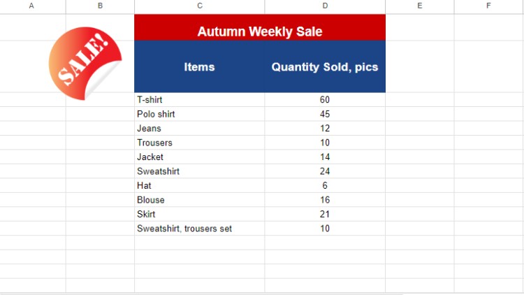
We’ll skip this step as we already arranged a document with entry data.
2. Data Selection
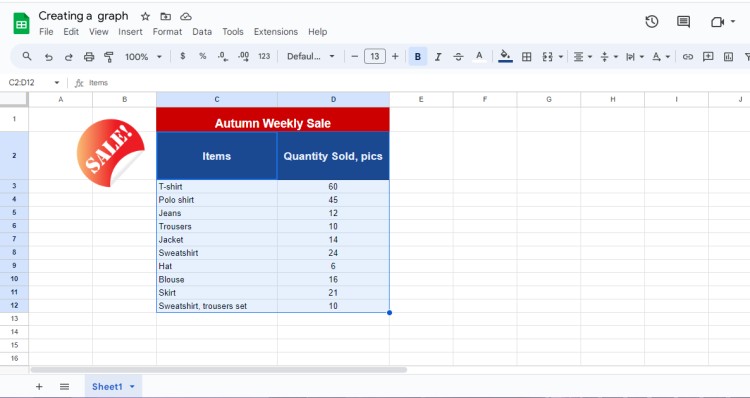
Once your data is ready, select the range of cells you want to include in your graph. Use the mouse to drag the blue outline within the necessary cells like in the picture below.
3. Accessing a Chart editor
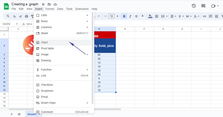
Now go to the Insert menu and choose Chart.
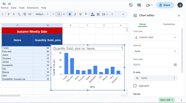
After you click on the Chart menu, you will see a default chart type on the page. Now it’s time to change the type according to the task.
4. Choosing the Appropriate Graph Type
Google Sheets offers various graph types such as line graphs, bar charts, pie charts, and more. Choose the graph type that works best for your data. For example, if you're comparing data categories, a bar chart may be more suitable, whereas line graphs are great for showing trends over time.
💡You may wonder if graphs and charts are the same visuals and why some are called graphs, and some – charts. By default, graphs represent data in lines with X and Y axes or columns, while charts show information within visually appealing formats like diagrams, chart pies, and more.
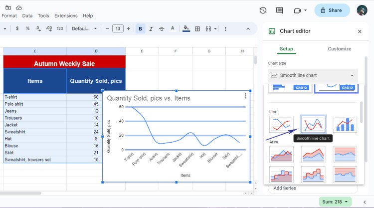
To choose the type, open the Chart Type submenu and scroll down to find the most appropriate. Above you’ll find Suggested graphs, and then the rest of the categories.
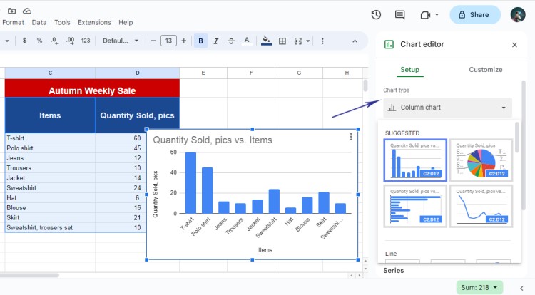
Thus, for this tutorial, we’ll go with a Line Graph.
5. Customizing the Graph
After selecting the graph type, you can customize your graph to enhance its visual appeal and effectiveness.
Add titles, labels, and legends to ensure clarity. Experiment with different color schemes and formatting options to make your graph visually appealing and easy to interpret.
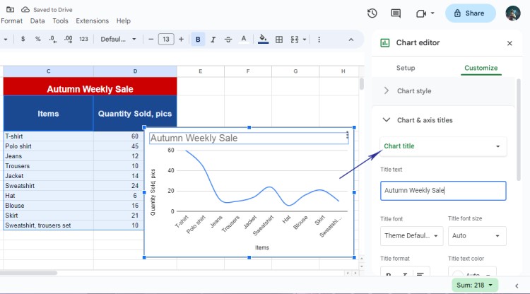
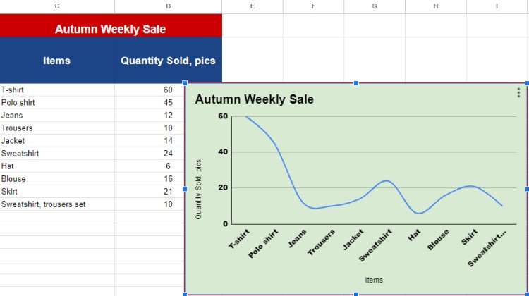
But first, let’s change the graph title by clicking on Chart & Axis Title. We’ll name it the Autumn Weekly Sale.
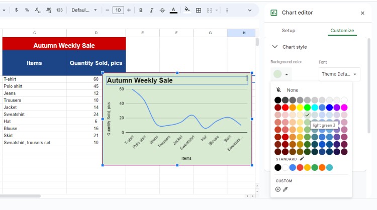
Our graph looks rather plain in a white color, thus, let’s give it some vibrancy! To change the background color, choose Chart Style, and find a color palette for BG. We applied a light green color.
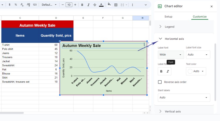
To change fonts of horizontal and vertical axes, choose the relevant Axis title and access Label Font. From there, choose the one you think is appropriate.
We’ll go with a Wide font.
Now let’s see what it looks like.
6. Advanced Features
Google Sheets provides advanced features for graph creation.
Explore options like adding trend lines to display data trends, combining multiple data series into a single graph, or using formulas to calculate and display additional metrics. These features can help you dig deeper into your data and gain valuable insights.
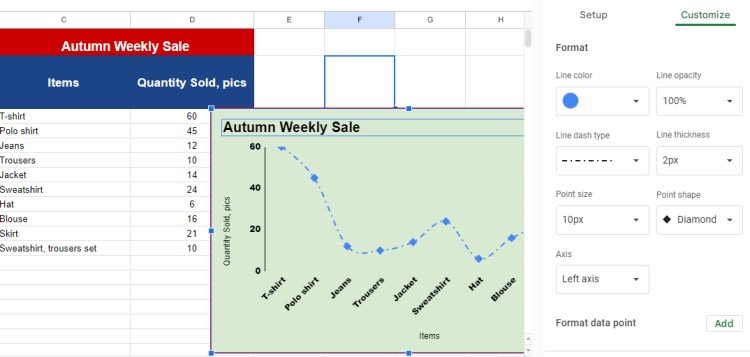
For this tutorial, we will change a line dash shape into a Dash Dot and apply a Diamond Point Shape.
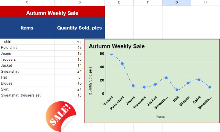
Let’s see the final result!
Useful Tips for Creating Stunning and Clean Graphs
Creating visually appealing and informative graphs requires attention to detail. Moreover, if you are going to share it with colleagues and upper management, you would like to provide accurate and professional visuals.
Consider these tips to improve your graph creation skills:
Select the Right Data
Before creating a graph, carefully evaluate your data and select the appropriate data range for your graph. Ensure that you are using relevant and accurate information to support your analysis effectively.
Accurate Labeling
Labeling is crucial to ensure that your graph is easily understood. Clearly identify the x and y-axes, add appropriate titles, and provide context to enhance the reader's understanding of the data being presented.
Use Appropriate Graph Types
Different types of data require different graph types for optimum visualization. Choose the appropriate graph type that best represents the relationship between variables in your dataset. A bar chart may be ideal for comparing data categories, while a scatter plot can be effective for showing correlations.
Enhance Visual Appeal
Make your graphs visually appealing by using colors, font styles, and formatting options. Highlight significant portions, add legends, and consider using annotations to explain any outliers or interesting observations.
Update Graphs with New Data
As your data updates over time, ensure that your graphs reflect these changes accurately. Regularly update your graphs to maintain their relevancy and communicate the most up-to-date information.
FAQ – Find Your Answer!
If you are a newcomer to working with spreadsheets, you might have additional questions, and below we prepared several Q&A to make some clarifications.
Q1: How can I change the graph type after creating it?
A: To change the graph type in Google Sheets, select the graph, click the Chart dropdown menu, and choose a different graph type from the options provided. Your graph will automatically update to the new type.
Q2: Can I import data from external sources?
A: Yes, Google Sheets allows you to import data from various external sources using import functions. You can import data from CSV files, websites, or even connect to external APIs to populate your Google Sheets document.
Q3: How do I share the graph with others?
A: To share your graph with others, click on the Share button in the top right corner of your Google Sheets document. Specify the email addresses of the people you want to share the graph with, select their access level, and click Send. They will receive an email invitation to view or collaborate on the graph.
Creating graphs in Google Sheets is an essential skill for anyone involved in data analysis and visualization. By harnessing the power of graphs, you can unlock valuable insights, make informed decisions, and effectively communicate your findings.
We hope you learned something new from our tutorial and can use it in practice!
Practice regularly, and soon you'll become a master of graph creation in Google Sheets. Good luck!

We are a team of creative people who dream of sharing knowledge and making your work and study easier. Our team of professional designers prepares unique free templates. We create handy template descriptions for you to help you choose the most suitable one. On our blog, you'll find step-by-step tutorials on how to use Google Products. And our YouTube channel will show you all the ins and outs of Google products with examples.


