How to Design a Newsletter in Google Docs

To outline important information, weed out everything unnecessary, pick up a stylish layout of elements, colors, and fonts, you better use ready-made templates made by professional designers.
It’s time to use the gallery of https://thegoodocs.com
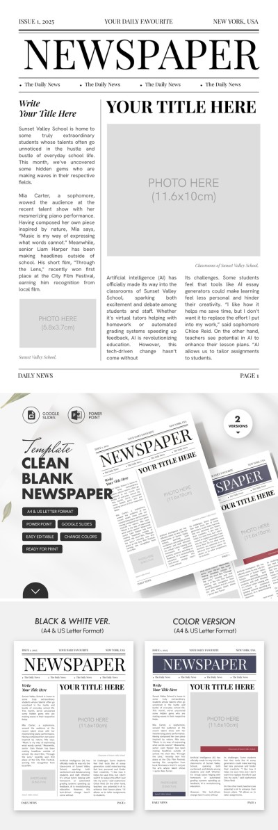
In the Newsletter section, you will find a wide variety of examples of newsletters: stylish two-page, classic ones 4-page and 6-page, tri-fold format, and simple one-page. They are suitable for both print and email newsletters.
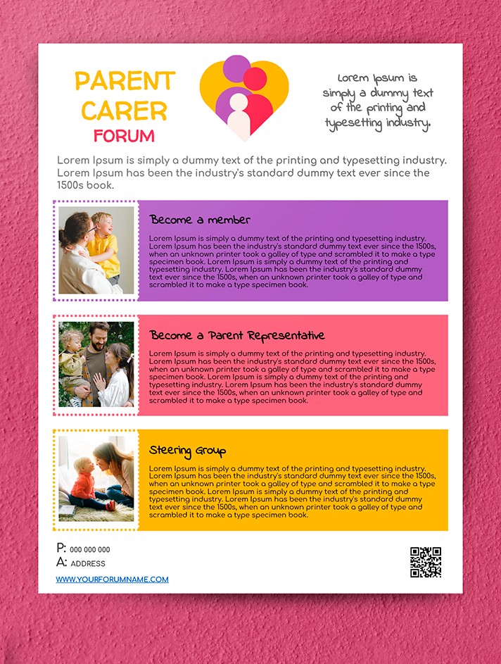
The Parent Newsletter is a great example of a topical and simple yet informative newsletter. It is bright, colorful, and well-designed. Available in two convenient sizes: A4 and US Letter. You can easily and simply prepare the perfect news product based on it, guided by just three simple principles.
Choosing the Сoncept
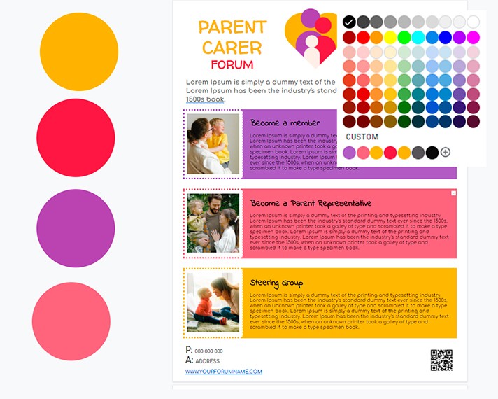
Choosing a concept and a style based on the theme of the future event is the first thing you should do on the way to preparing the newsletter. For a fun event such as a parent forum or a children's festival, colorfulness and brightness, fun elements, and pleasant photographs are the best fit. For a business conference, on the other hand - restrained colors, laconic fonts, and a maximum of two to three colors.
Information Optimization
You need to focus on these aspects of a newsletter to optimize the information:
- A logo and a name of a company, firm, or organization
- relevant photos, images, schemes, and diagrams
- important information about the meeting, event, or festival
- venue, tickets, entrance, and participation fee contact details
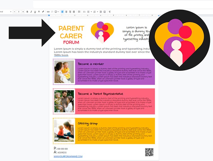
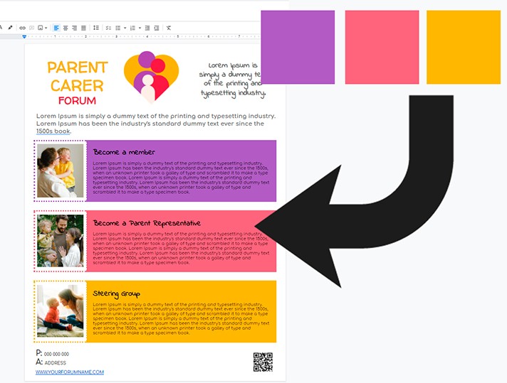
It is better to place the logos and names at the top of the template. Consider putting it into the top left corner as it attracts the most attention.
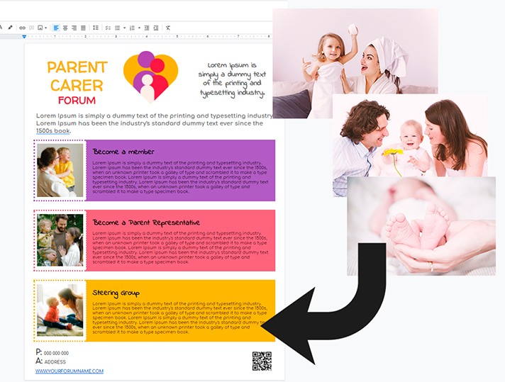
It is important to correctly compose photographs and other graphic elements. Thus, the person who holds the flyer can easily focus their eyes on the most important elements, without missing out on minor details. Therefore, make sure to choose pictures and images in the same color scheme. If the photographs are too different in color, brightness, and tone, opt for black and white options.
The main information is better be divided into at least three text columns. You can highlight them with bright colors. The font should be simple, large, and easy to read. Otherwise, your potential client might be too lazy to put that extra effort to read.
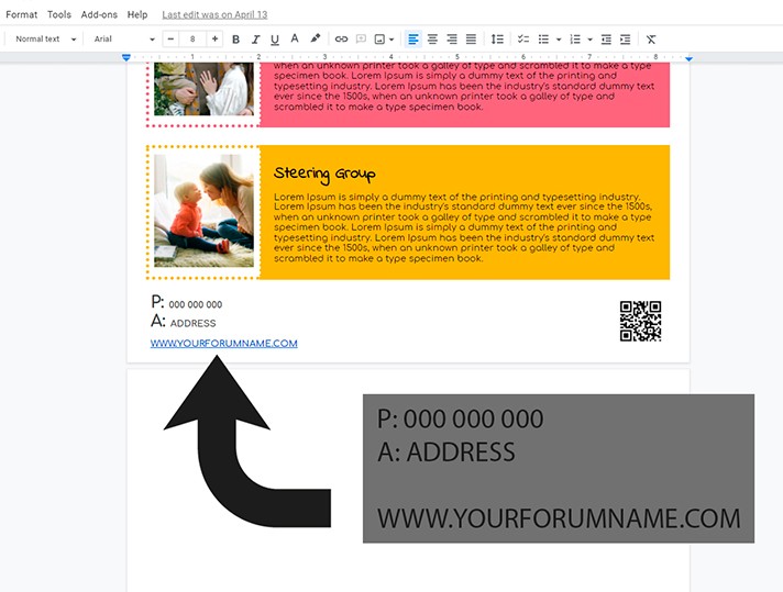
Contact information is better to be placed at the bottom of the leaflet. Phone numbers, addresses, the company's website, and email are enough. Well, you can also specify a QR code.
Use of the Google Docs Innovations
The Google docs text editor is getting updated often, which means that even usable features appear in your arsenal.
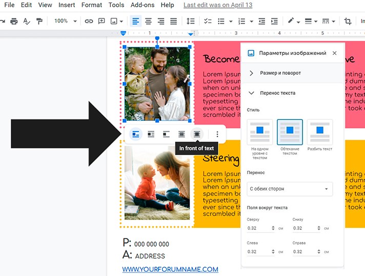
For example, take a look at the additional options in the Image Options section. With their help, you can now not only set images on the same level with the text but also use text splitting and text wrapping and place pictures and photos as a background ("behind the text" - Behind text) and directly on the text itself, overlapping it (respectively - In Front of the Text).
Following these three simple principles and using ready-made templates for thegoodocs.com gallery, you do not have to study design computer programs on your own. Just trust the professionalism of the designers and save your time for work.

We are a team of creative people who dream of sharing knowledge and making your work and study easier. Our team of professional designers prepares unique free templates. We create handy template descriptions for you to help you choose the most suitable one. On our blog, you'll find step-by-step tutorials on how to use Google Products. And our YouTube channel will show you all the ins and outs of Google products with examples.


