5 Steps to Create a Party Flyer Using Google Docs
We highly recommend paying your attention to this gorgeous flyer from a flyer collection. Good thing is, it can be easily edited and customized to your liking:
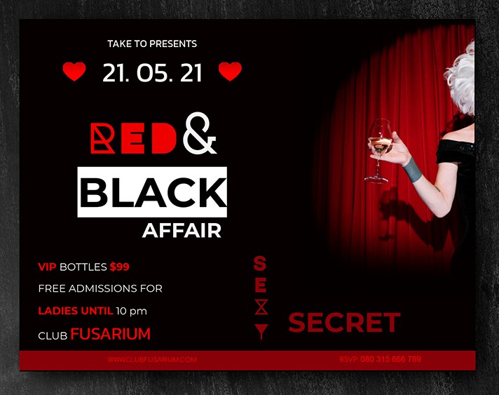
But what is worth remembering before starting to get creative? Let's highlight 5 main points with the help of which your flyer will be not only bright and stylish but also professionally executed.
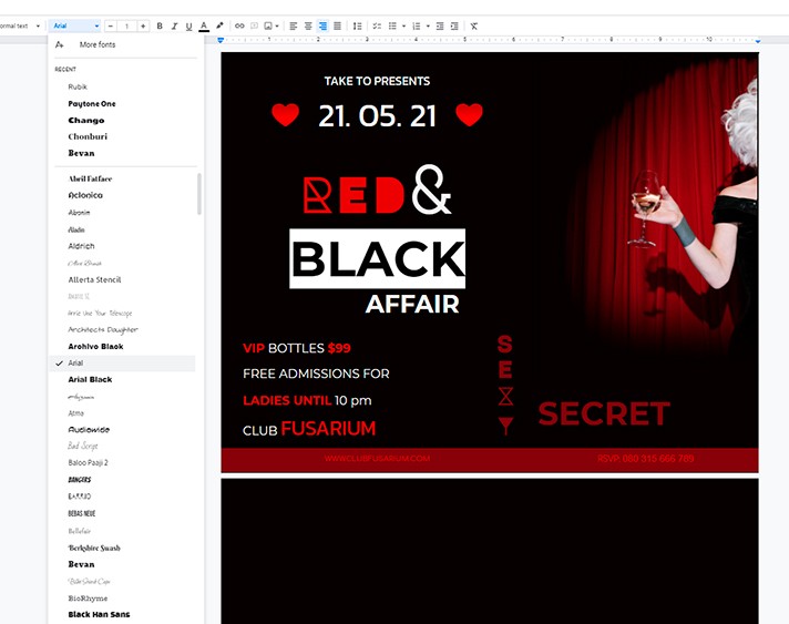
Step 1. Use no more than 3 fonts
When you start thinking out of the box, it is hard to limit yourself to 1-2 fonts. Especially if you keep in mind a huge variety of them. But do not get lost in the abundance of shapes and configurations and neglect the rule of three fonts. Since it is difficult for the human eye to focus on a lot of things, the flyer runs the risk of losing interest from the potential audience.
The use of more than three fonts can only be justified in exceptional cases.
Step 2. Use only important information
The main purpose of any flyer is to convey information. But the competent presentation of such information is also something special like an art.
Therefore, remember an important rule - no extra information should be placed on the flyer!
A lot of novice designers get lost in questionable experiments, wanting to use everything they know in one template: imitations, different styles, and motives at the same time, heaps of many color combinations. Of course, it does not make the flyer any more attractive.
Remember this one: modesty and laconicism will always look more advantageous than kitsch. Hence, you should not try to fit everything onto one flyer.
Step 3. Add a picture
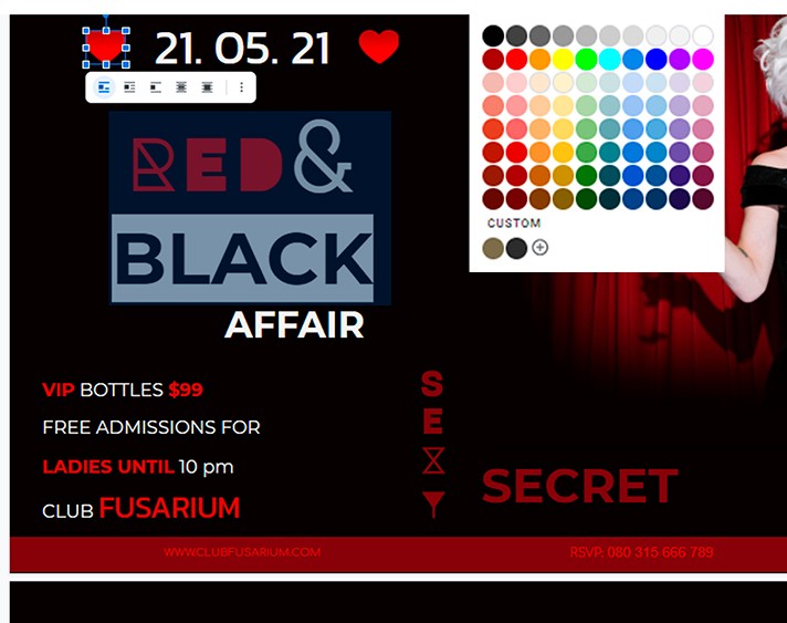
Of course, not all flyers require adding a photo. A lot of them are easy to do with illustrations or no graphic elements at all. But if the picture looks good and well illustrates the upcoming event, then you cannot do without it.
Make sure to choose photos that match the overall color palette of the flyer. Do not be afraid of retouching and artistic processing if you think the design idea requires it.
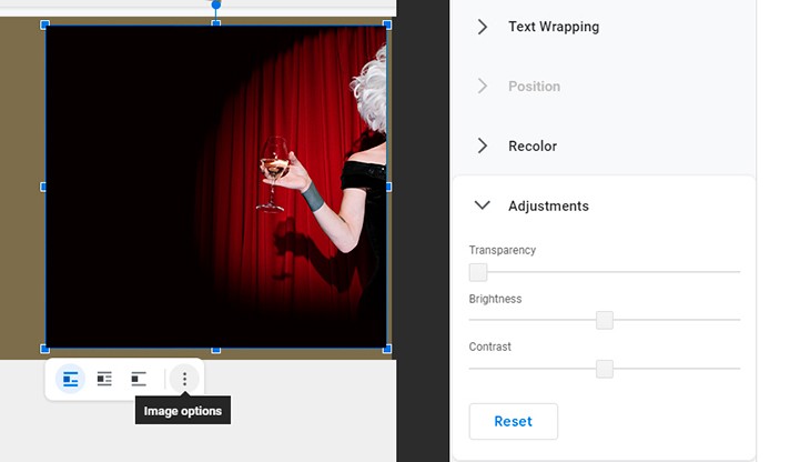
Also, adding photos in real-time is a breeze if you use Google Docs text editor. You can use simple drag and drop of the image, or you can use the photo address on the web without saving the photo on your computer: Insert - Menu - Image - By URL.
Step 4. Come up with new solutions
New ideas are the engine of progress. Your potential audience will definitely be interested in a fresh solution. Whether it's a witty slogan, an intricate font, or an ironic picture. Show your critical thinking! Sometimes interesting ideas are hidden in the really familiar things.
Don't frame yourself. Perhaps this is an unconventional use of black or, conversely, white. Or maybe it would be a good idea to write in the questionable pink or brown? If we are talking about a party, you are welcome to experiment!
Step 5. Choose a spot for contact data placement
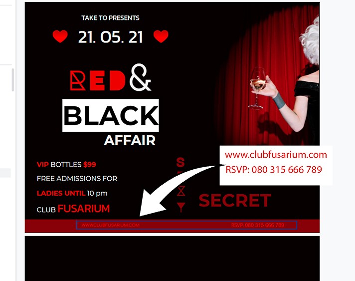
While the previous rules were about attracting a potential audience, then the 5th, last, item on the list concerns its retention. Placement of contact details - phone numbers for quick communication with the organizers, chats, e-mail address, the venue of the event - is extremely important. You should not allocate front pages for contacts, but you should also save the client from making an effort to search for it on the flyer.
With these simple 5 rules, your flyer will definitely attract as many guests as possible!

We are a team of creative people who dream of sharing knowledge and making your work and study easier. Our team of professional designers prepares unique free templates. We create handy template descriptions for you to help you choose the most suitable one. On our blog, you'll find step-by-step tutorials on how to use Google Products. And our YouTube channel will show you all the ins and outs of Google products with examples.


