5 Steps for Creating a Party Poster Using Google Documents
What if you need an attractive party poster? Bright, stylish, and colorific. One short glance at this – and you are up for a big party. Google Docs will easily cope with that, too.
Pay attention to the following party poster Orange Party Poster
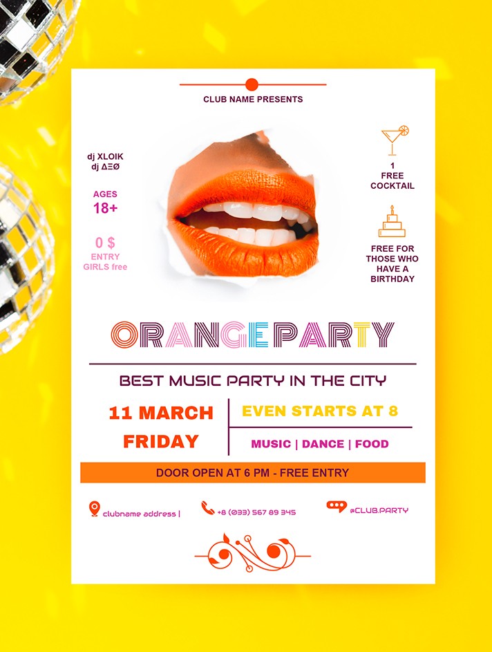
Such a poster is the perfect match for a summer pool or cocktail party somewhere over the city. Just imagine a spacious terrace on top of a skyscraper or a business center. Sound lit, right?
Step 1
First of all, you have to choose the concept. It is not necessary to pursue the full uniqueness. Originality does not always mean success.
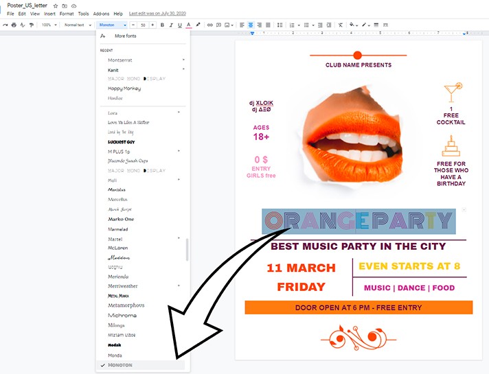
Following the beaten path is also an available option. If this is a colorful fun party, we recommend you pay attention to the central image. Juicy lips in a smile are exactly what you need! Playful, fresh, and at the same time very sensual. After the photo, it would be good to choose a colorful font for the party name. In this case, the designer used Monoton. However, you can easily replace it with another one. To do this, you need to choose the Font on the toolbar and select the one that fits you most from the drop-down list of the gallery.
Step 2
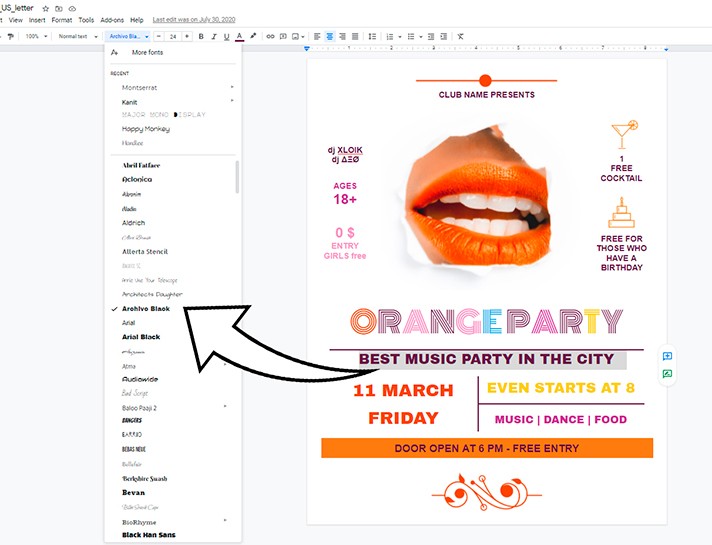
The next important point is the name of the club and the concept of the party or its slogan. We’ve chosen the BEST MUSIC PARTY IN THE CITY using a concise font Arohlvo Black.
Step 3
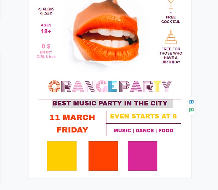
Next, we have basic information about the venue, date, bonuses, etc. This information is better to be placed immediately after the concept of the event. We recommend you highlight it with a bright color or unconventional font (but keep in mind that it is better to stop at one thing - either color or font).
In our case, we put an emphasis with the help of color. Yellow, orange, and violet – these colors always win-win. Besides, we also took into account the principle of complementary color contrast.
Step 4
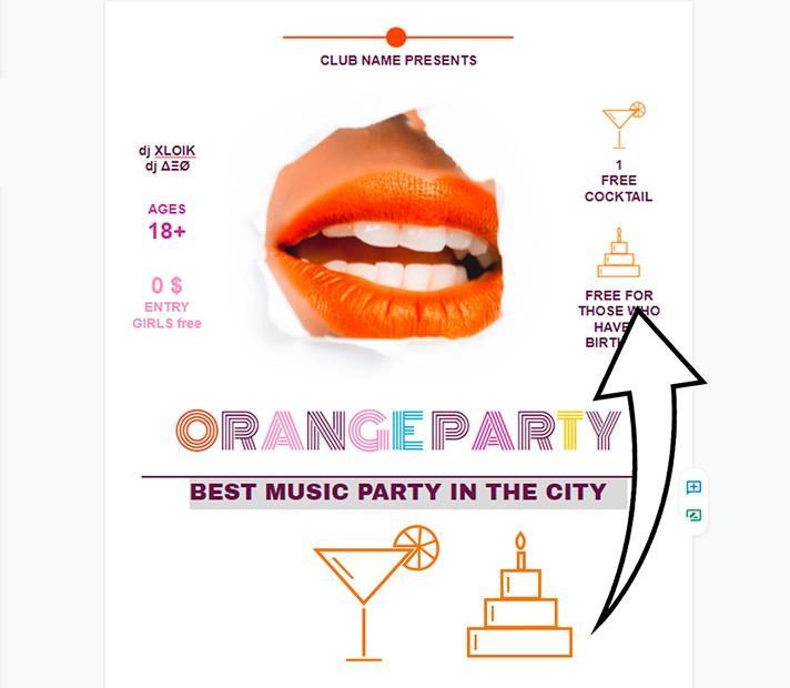
The next important point is information about prices, special offers, guests, and DJs as well as possible dress code, promotions, and bonuses. It is better to place it at the level of the photo so that the person can quickly figure out the key points without running their eyes in search of the necessary information.
That is why it would be nice to accompany this information with some minimalistic illustrations or icons. Make sure they don't distract attention, and at the same time, complement the text groups.
Step 5
Finally, the last point is contact information.
It is best to allocate space at the bottom of the page for contact information. Do not put all the details. Phone numbers for quick communication, the website, and the venue will be enough. You can also add an email address as well as links to work accounts on popular social networks.
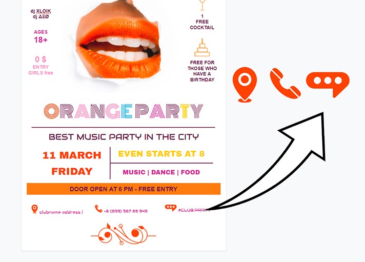
This way, we will have a great design poster for an unforgettable party - no one will be able to pass by!

We are a team of creative people who dream of sharing knowledge and making your work and study easier. Our team of professional designers prepares unique free templates. We create handy template descriptions for you to help you choose the most suitable one. On our blog, you'll find step-by-step tutorials on how to use Google Products. And our YouTube channel will show you all the ins and outs of Google products with examples.


